
Ellipse Brand Identity Redesign
The Challenge
As a challenger brand in the Group Risk industry the revised identity needed to remain bold and unafraid, retaining their specific orange brand colour. It also needed to resonate more with each of their three audiences – achieving cut-through and stand out amongst advisers whilst appearing credible and trustworthy for employers and employees.
Moreish Approach
We created a visually striking brand that struck the right balance of fresh and eye-catching yet dependable and authoritative, therefore appealing to both advisers without alienating the end user of the service.
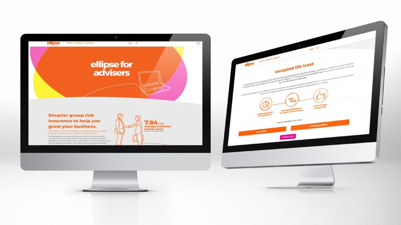
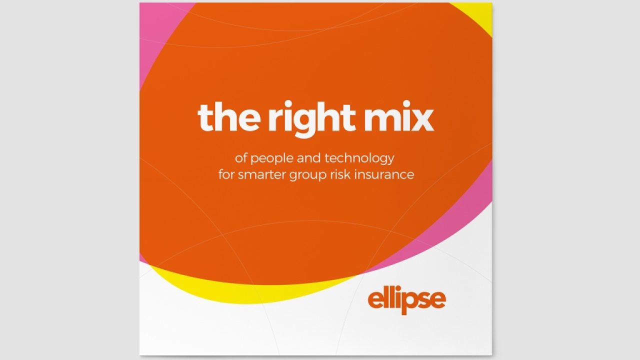
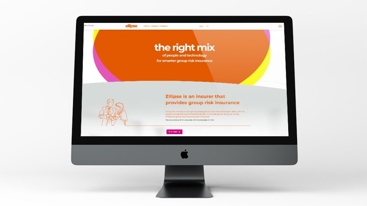
The core brand graphic, of two overlapping ellipses representing ‘people’ and ‘technology’, is a clear visual representation of the proposition. The breakdown of the two colours used into these ellipses create the Ellipse brand orange when they overlapped, visually showing how ellipse is ‘the right mix’. The result of this is a bold and contemporary identity in a typically corporate industry.
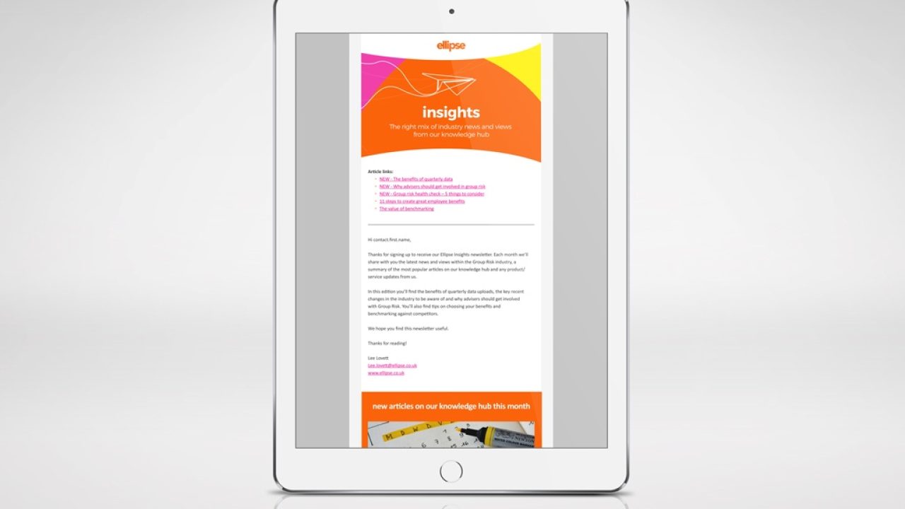
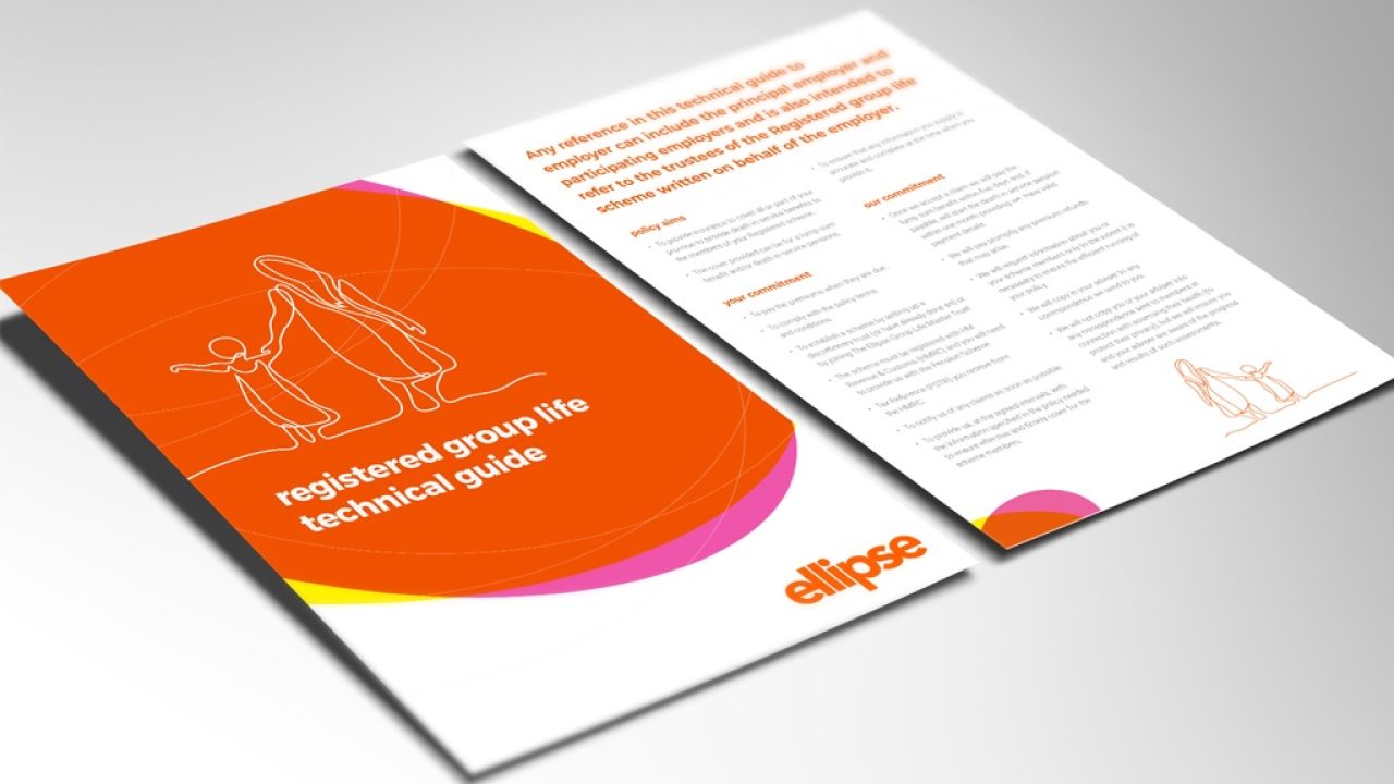
To create further distinction from competitor brands we moved away from using standard lifestyle stock imagery, instead creating a bespoke illustration style. These illustrations were formed of a ‘continuous line’ which, together with the ‘Ellipse curves’ that were introduced, represent Ellipse’s continuous striving for innovation and improvement and add a sense of movement and agility to the brand.
The new brand positioning and visual style was applied to various communications including a new website, product videos, email templates, internal comms and brand stationery and templates.
Moreish Results
- When asked, 57% of advisers said they thought the change of brand emphasis was positive, only 2% thought it was negative.
- Significant increase in adviser brand awareness and site traffic
- Within 1 year of rebrand helped lead to the successful sale of the business to AIG Life
If you’re looking for a financial services agency that specialises in Insurance Marketing, get in touch here.
© 2024 Moreish Marketing