Key Partnerships Brand Campaign
The Challenge
After developing a new proposition, Key Partnerships needed a new brand to match and bring the proposition to life. The refreshed identity needed to complement the parent Key Group brand and make sure we could appeal to intermediaries with high net worth clients who currently have a downmarket view of equity release.
The Moreish Approach
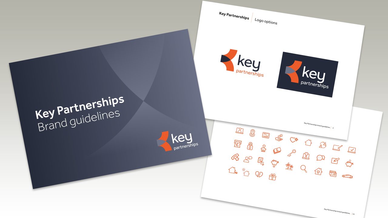
By replacing the red in the Key brand with dark blue and adding a gradient, we created a clean and high end feel. The blue was then used in various curves and swooshes that reflected the shape of the logo.
To stand out from competitors, we chose not to use any lifestyle stock imagery and instead used a combination of cut out images, line drawings and icons. The core brand orange was used as an accent colour for the icons and line drawings against the dark blue to create a contemporary identity.
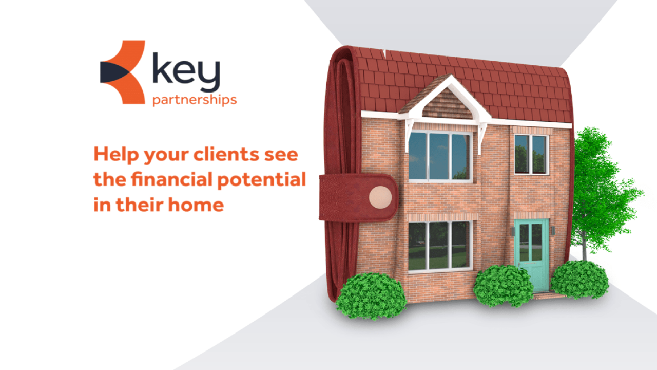
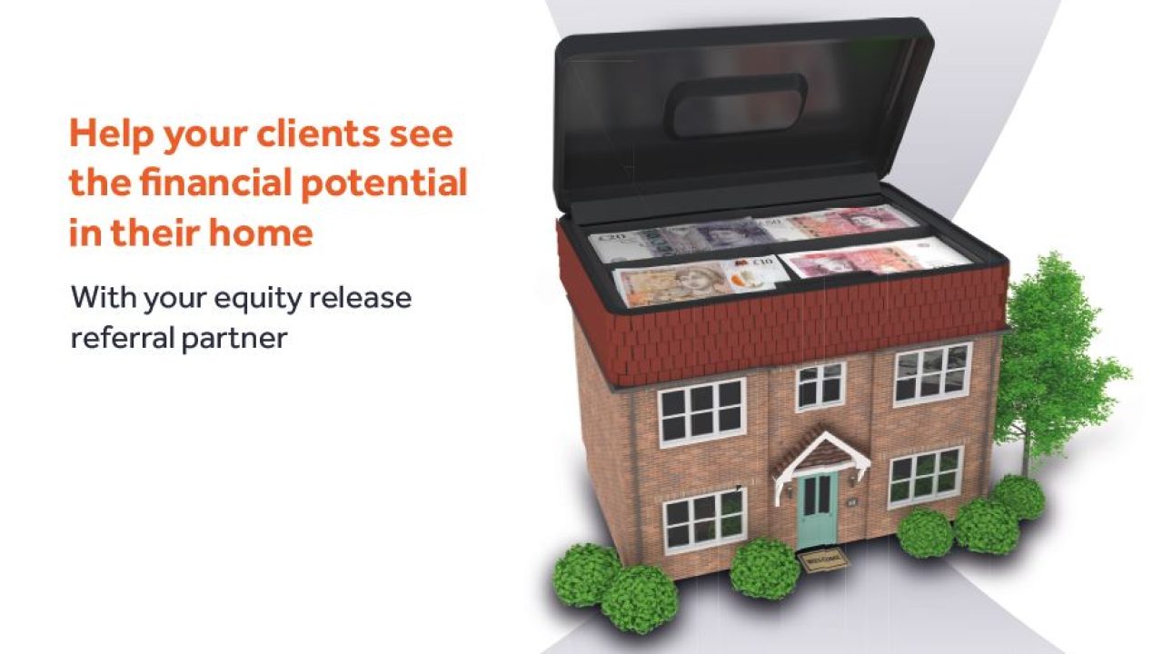
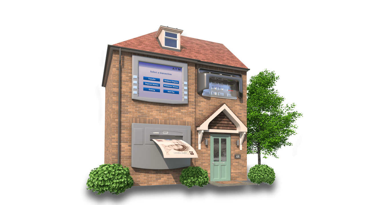
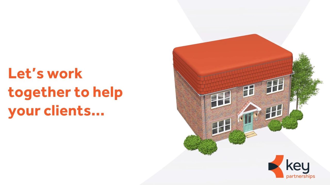
To create even more stand out, for our launch campaign we created a collection of 3D house images that reflected the new proposition of working with intermediaries to help their clients unlock the financial potential in their homes. We visually linked the houses to the financial equity within them; from a house that looked like a purse, to one with its roof up to reveal a money tin.
As well as refreshing the brand identity, we developed a new website and various communications.
The Result
When comparing the July-Dec 2019 campaign launch period vs. the same period in the previous year, we saw:
- A 23.7% uplift in new referral partners over this period (649 to 803)
- Leads up 6.7% (2,187 to 2,333)
- Loans issues up by 8%
- Resulting in additional borrowing of 11% equating to £7,897,252

Sectors
© 2024 Moreish Marketing

